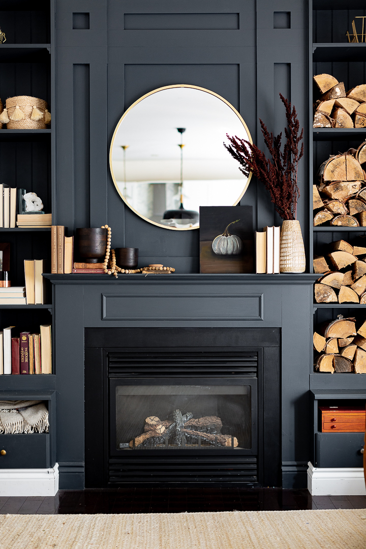
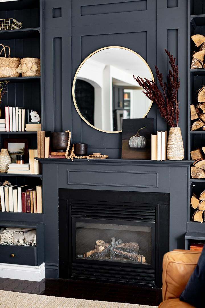
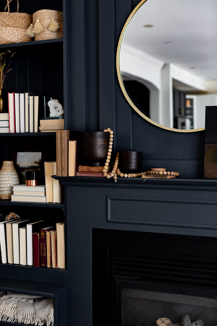
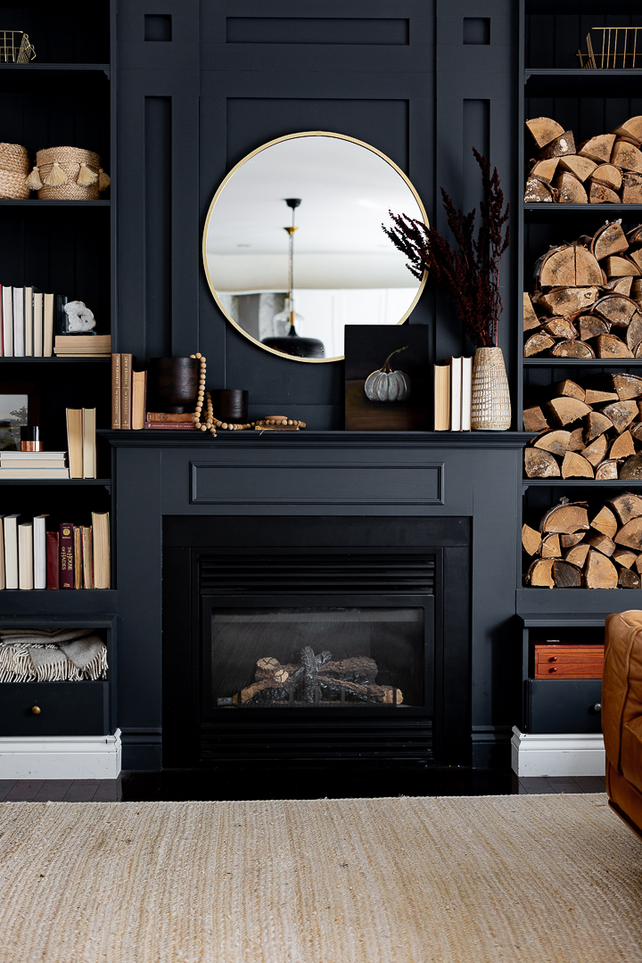
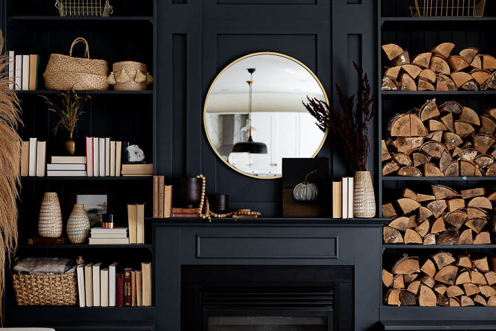
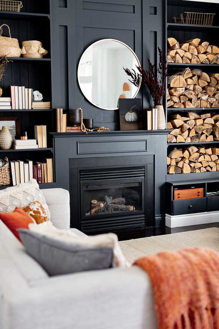
Hello friends. I hope your week is off to a great start. The weather has turned and the days are getting shorter and cooler. It’s time to start making our homes cozy. I’ve been digging up some old fall decor and decided that I would try to use things I already had to decorate this simple fall mantel.
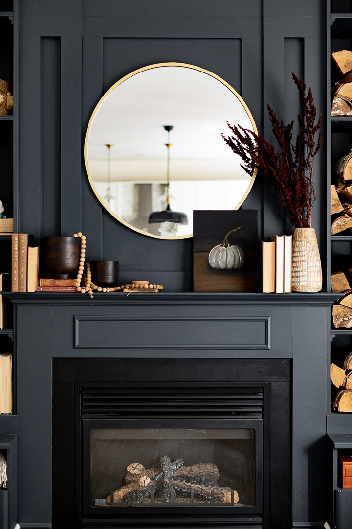
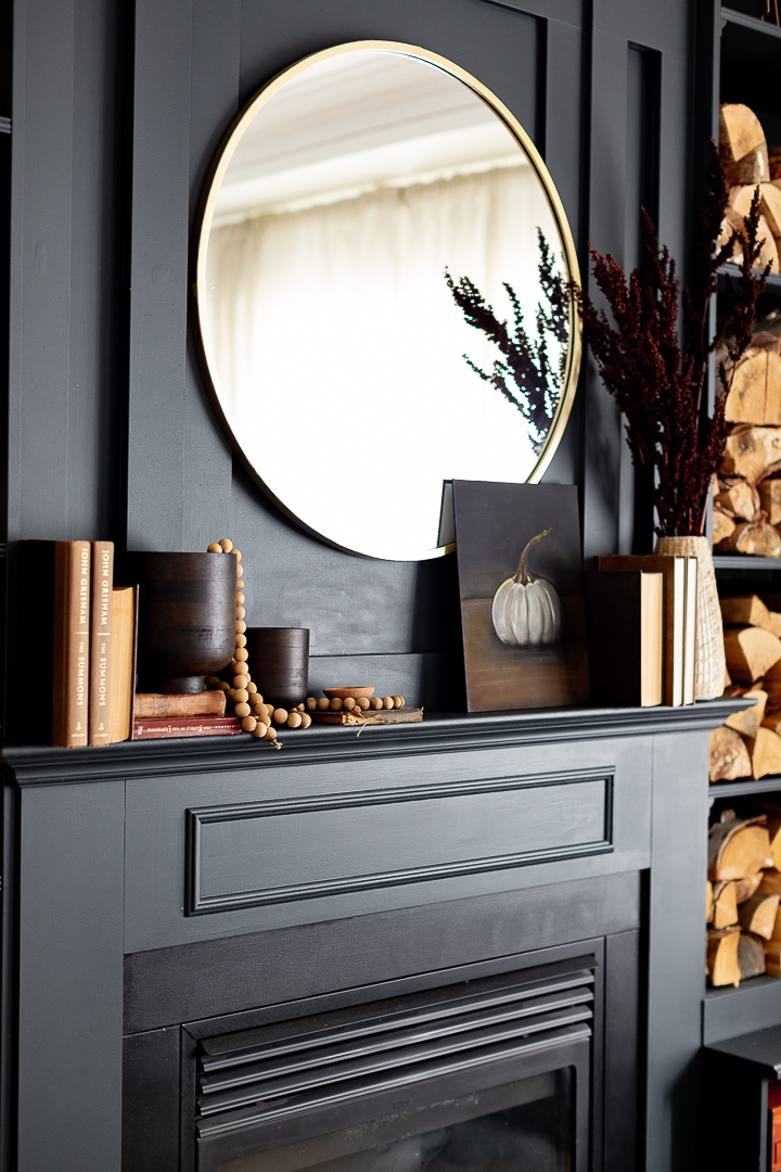
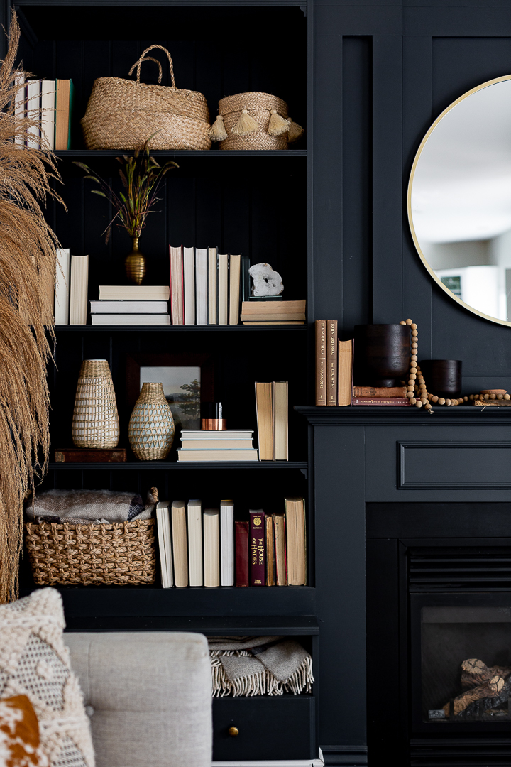
I got a couple old books and chose warm colors. There is really no rhyme or reason for how I decorated this mantel this year.
I just wanted to add various textures and fall colors.
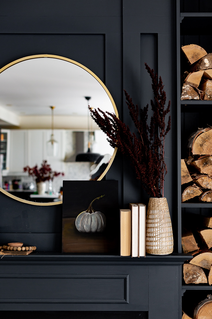
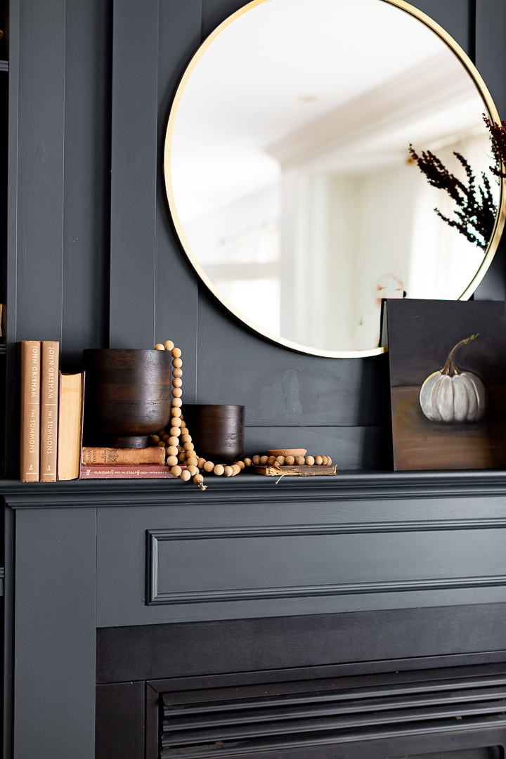 I bought these wooden vases from H&M home last year and hadn’ t use them.
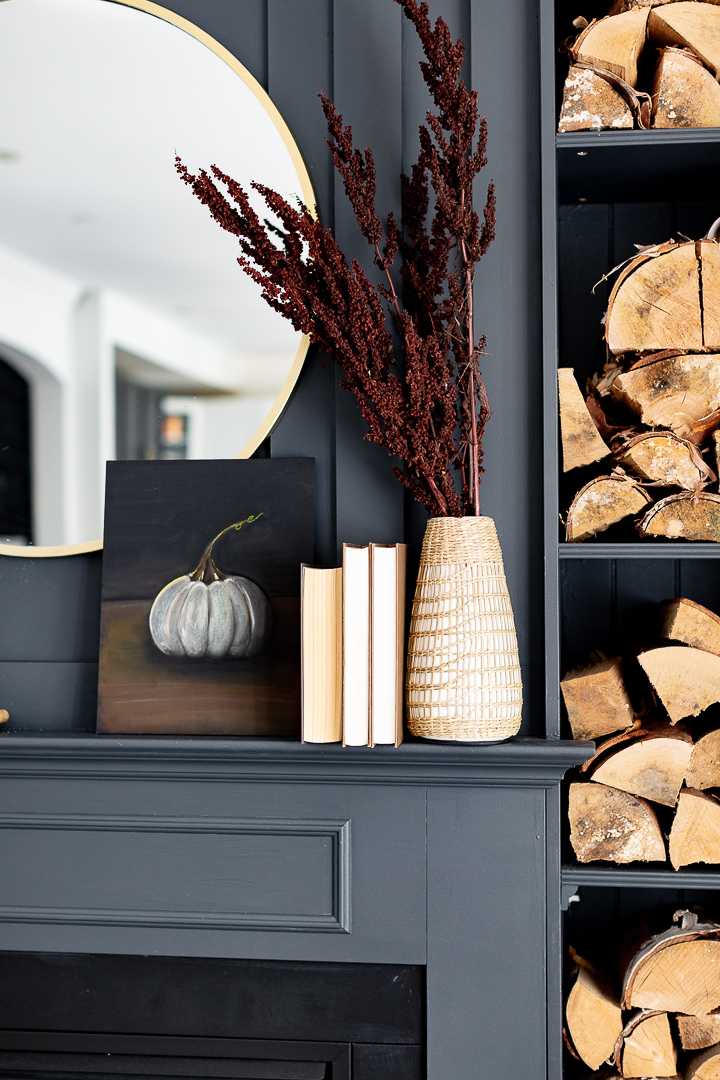
I picked those dry branches from the side of the road and I think the color is perfect! In case you missed it, I offered this pumpkin printable last week and you can get it HERE.
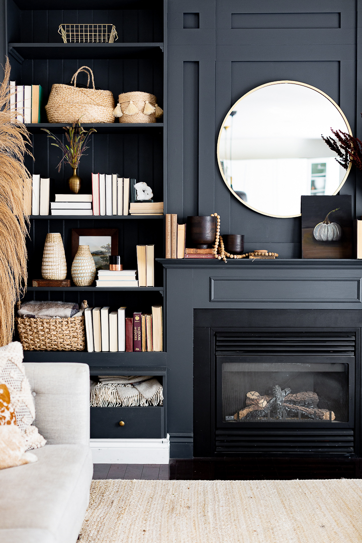
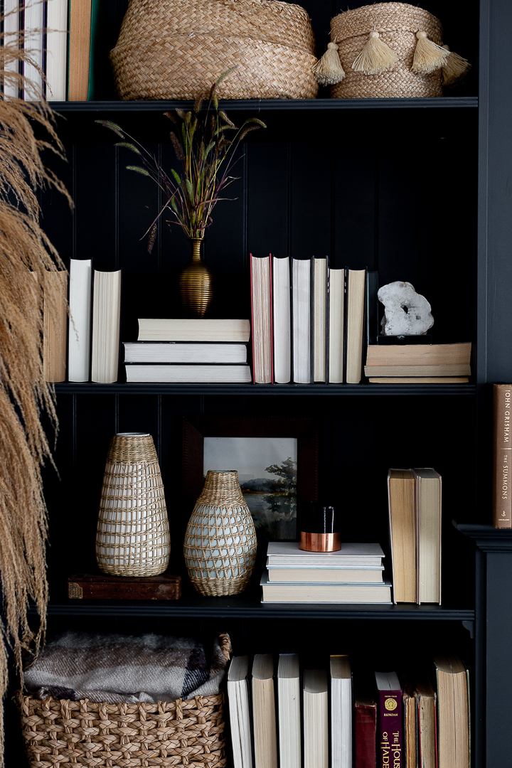
I added more books to the shelves. I’m still not sure if I like it or not…
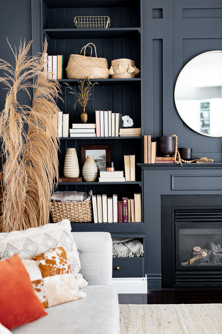
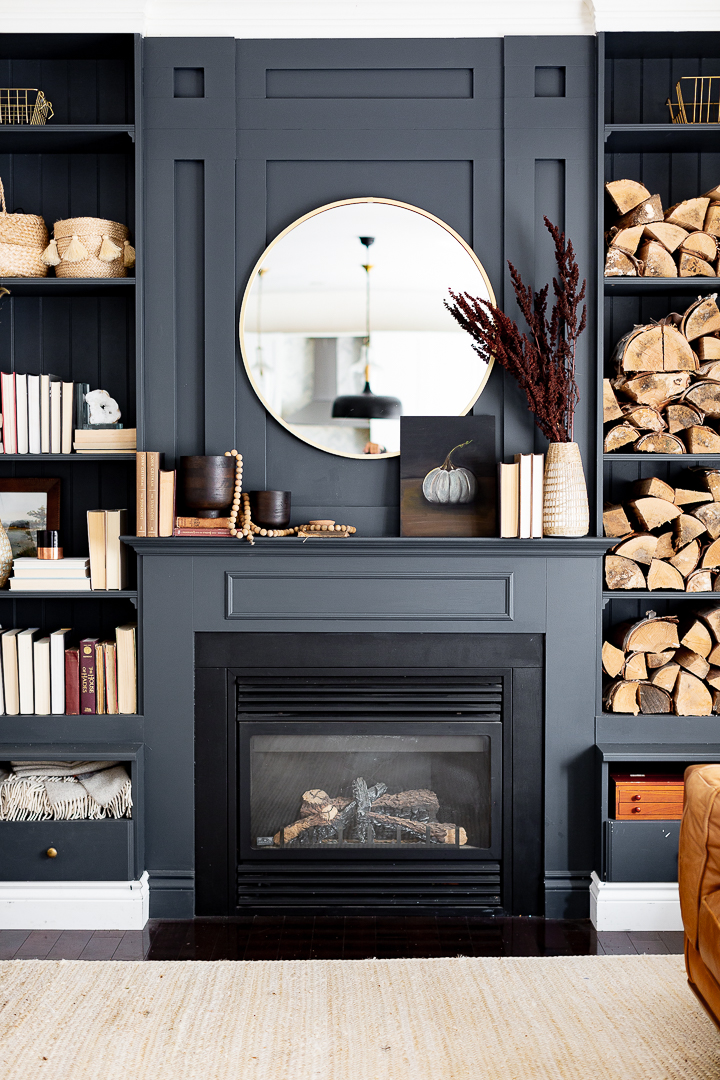
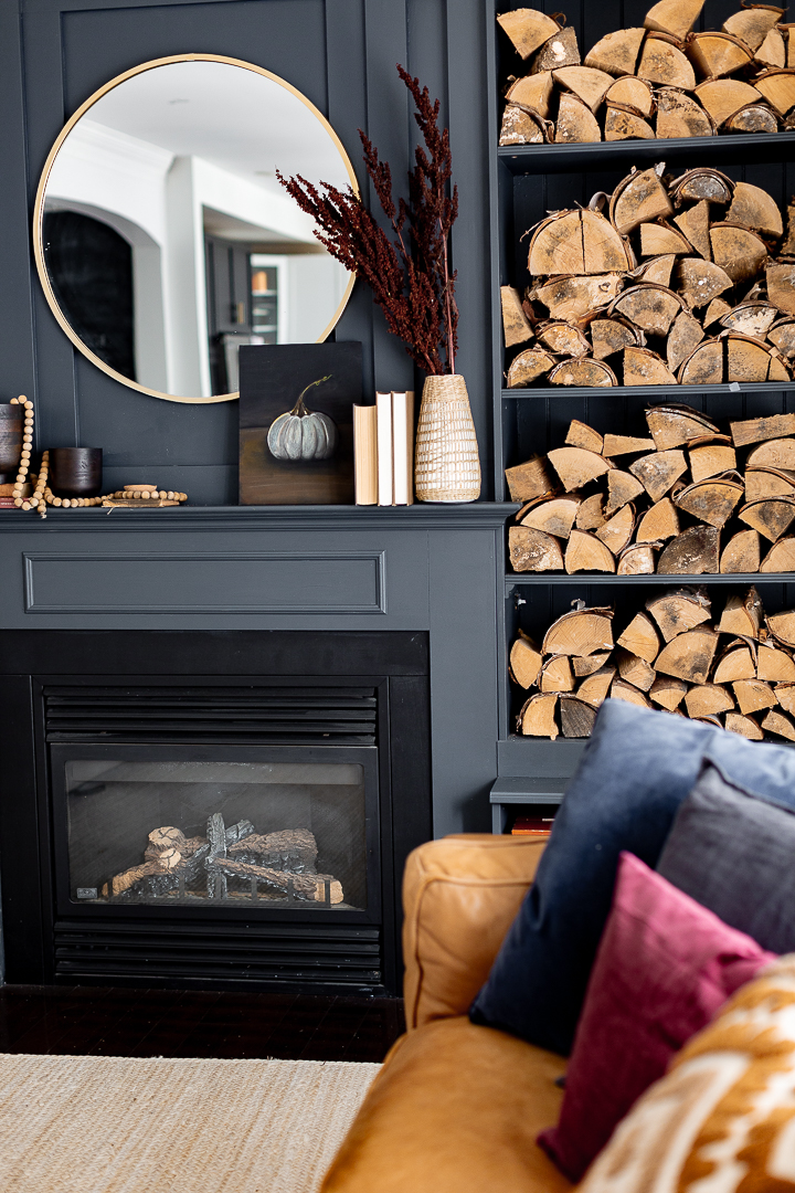
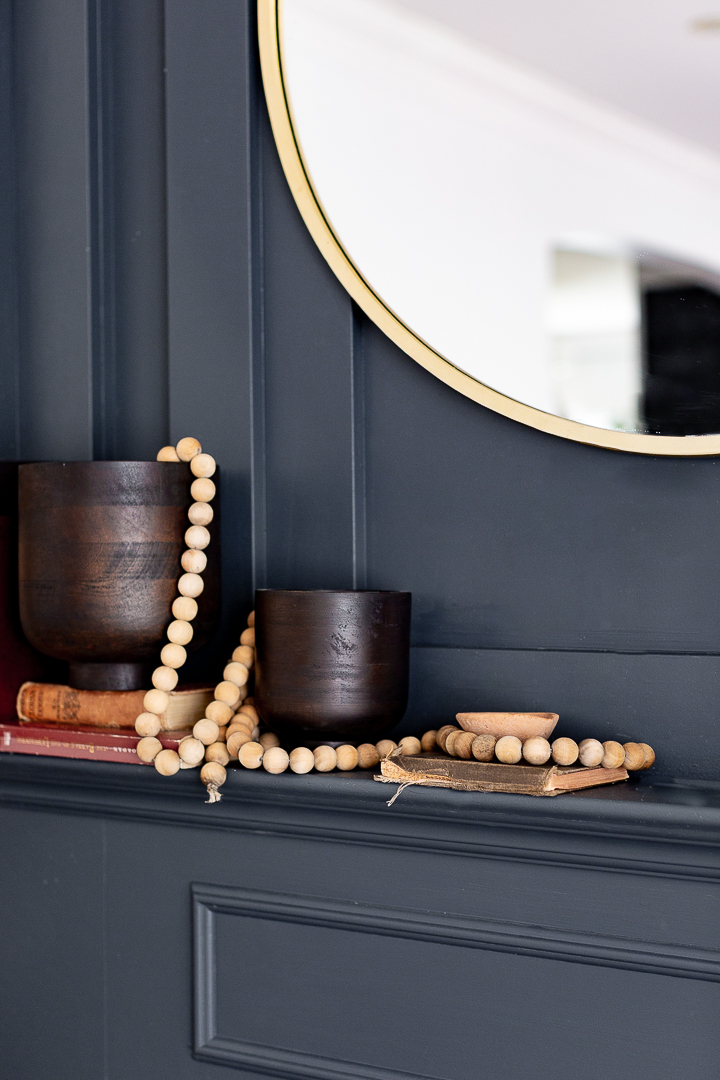
One of the easiest way to bring a neutral and texture are these wooden bead garlands…
 That’s about it for this simple fall mantel. Please make sure you check out the rest of the gorgeous mantels from my friends below.
A big thank you to my friend Krista for putting this hop together.
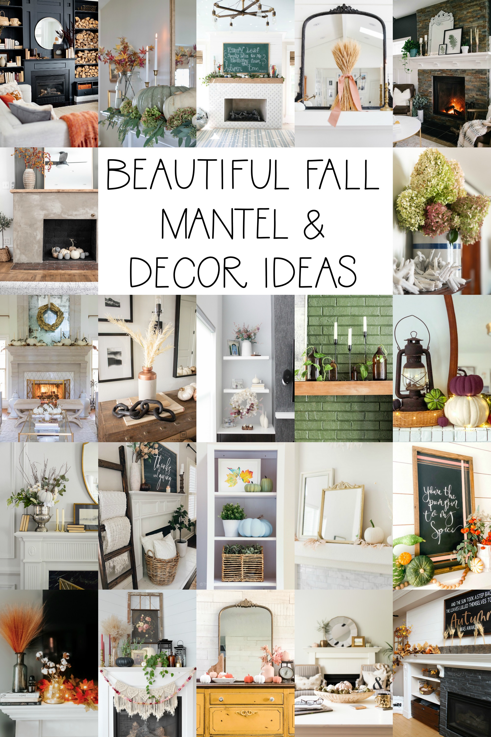


The Happy Housie ** Tatertots and Jello ** The Handmade Home
Modern Glam ** Taryn Whiteaker Designs

Craftberry Bush ** Cassie Bustamante ** Cherished Bliss
My Sweet Savannah ** The DIY Mommy

Amidst the Chaos ** She Gave it a Go ** Life is a Party
Clean & Scentsible ** This is Our Bliss

Finding Silver Pennies ** House by Hoff ** Rambling Renovators
Jennifer Maune ** Maison de Cinq

This is Simplicite ** Lolly Jane ** Life is Better at Home **

Absolutely gorgeous, Lucy. I love how your subtle fall colour scheme comes alive on the black background of your mantel!
just gorgeous! love how your style has evolved over the years… i love the moodiness!
Amazing, Lucy! I am obsessed with the dark moody color and contrasting accents! Gorgeous!
Oh Lucy! This is just so dark and moody and absolutely gorgeous!
Absolutely stunning as always Lucy! I love all of the wood and baskets against the black!
I love your sense of design, Lucy, but something I’m noticing in home decor photo shoots on a number of sites, and now on Craftberry Bush,, compels me to comment. Hopefully, this will give you and other bloggers and your readers something to thoughtfully consider.
What is with the trend with books placed backwards with the page edges showing instead of the spines?
Is it just to be novel (pun intended)? Shall we figure it a method to bring more neutral ivory into the Autumn composition? Or to add a little variation of texture upon the shelves? Whatever the motivation, I think this is a mistake, You can add neutral color and juxtapose texture in other ways. It’s not like such photos suggest an interrupted reading session, with one book set down on a nightstand, or a book left open on a coffee table. Consider that books interspersed on the shelves in turned-around fashion actually disrespects books (though I’m certain unintentionally). One or two books backward on the shelves might leave an impression that someone was in a hurry putting them away. More than that does not imply haste, but deliberation. revealing that the placement treats the books as mere props, instead of inviting their inclusion as objects with identities of their own, and as cherished additions to our lives… to be read and loved and cared for. Besides, one shouldn’t encourage the storing books in a way that exposes ungilded page edges to the effects of light. When I see books purposely arranged like that on shelves, it makes me want to reach into the photos and turn them around. I’m sure you just wanted to add to the ambiance of the room, but this decorating tack showing the page edges is a definite distraction. No, not a good look to encourage. IMO, not a good look at all.
I think the idea is to keep all the colors similar when viewed from a distance, but as a book lover, it makes zero sense to me. If I want to find a well-loved book, I don’t want to have to turn them all around to locate it. If a similar color is the goal, I’d prefer books covers to be made with titles added to the outside spine.
But overall, Lucy, it looks beautiful and yes to the books on the shelves!!!!!!! Your room makes me want to snuggle up and read while drinking a cup of tea and in my mind, that’s the perfect room.
fwefwe
Hi. Would be able to tell me the colour of your wall and mantel. Thanks.
Your room is gorgeous. I love the dark moody colours. Thanks for sharing.
Beautiful, Lucy, I love the cozy textures and colors. Still loving your dark paint in here. Love the books, too. xx
This is absolutely stunning. Would you be able to tell me what the black paint color is?
I was pretty pleased to discover this web site.
I want to to thank you for ones time due to this wonderful read!!
I definitely enjoyed every little bit of it and I have you saved as
a favorite to check out new things in your site.
What an impeccable style! Now I want to do the same. Already ordered a grid for the fireplace, similar to your grid, found it here, after reading all the reviews from buyers, I hope it will turn out as beautiful as yours!
I learned absolutely everything about my question when I read this post, thanks to the author for the detailed description. I wrote my review on the the academic papers review you can go in and read. Thank you very much for your attention and your time.
Hey!
Your choice of color is on another level, I love it
great content i enjoyed reading your article.keep up the good work.
Indulge your senses at “Sveta” restaurant (https://sveta-nyc.com/), where the authenticity of Ukrainian cuisine takes center stage. Immerse yourself in a world of exquisite flavors and textures, carefully curated to offer a dining experience that is both nostalgic and contemporary.