Hello everyone! I hope you’ve had a great week so far.
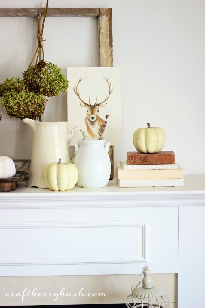
Yesterday I shared one of the early versions of this year’s fall mantel
and today I thought I would share the entire evolution of the mantel process.
Before anything else, my apologies for the quality of the photos. As mentioned
in my previous post, I often take a quick photo when staging a vignette or mantel
to provide perspective. As such, many of the these photos were taken quickly
and without regard for lighting with some of them even being a little blurry…eek.
Nevertheless, here is the evolution of the fall mantel….
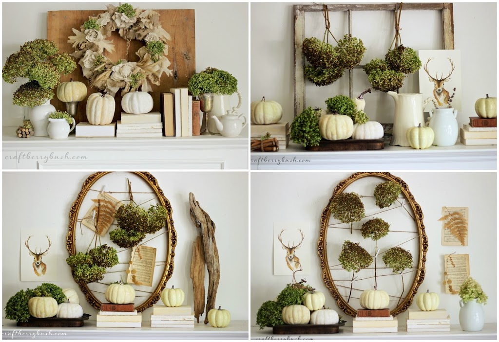
This collage gives you the entire picture, but
let’s take a look at each of them individually…
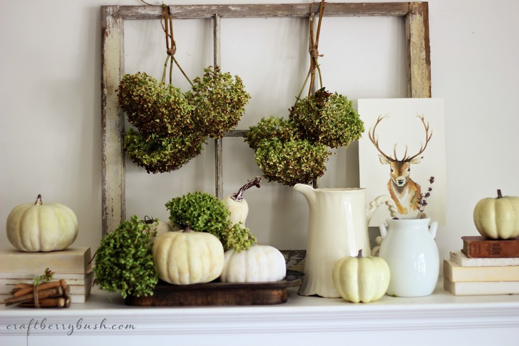
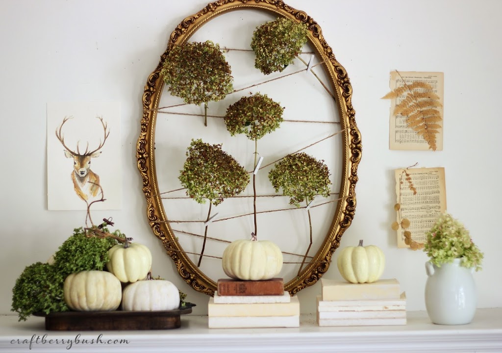
There was no doubt I wanted to use dried hydrangeas and
neutral colours. I like the way the hydrangeas look hanging on the old
window frame, but felt it was too small for the scale of the wall.
neutral colours. I like the way the hydrangeas look hanging on the old
window frame, but felt it was too small for the scale of the wall.
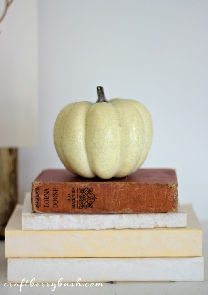
I had to use fake pumpkins because at the time, I could not find
any real ones. But I think it looks okay sitting on the old books, no?
any real ones. But I think it looks okay sitting on the old books, no?
Even though I really like the old window frame as the backdrop, I was still loving
the idea of using the old mirror frame I had used for my late summer mantel (here).
The hydrangeas just seemed to be positioned too symmetrically
and if you’ve been following me for a while, you will know symmetry
and I do not get along as I find it constricts my creativity.
the idea of using the old mirror frame I had used for my late summer mantel (here).
The hydrangeas just seemed to be positioned too symmetrically
and if you’ve been following me for a while, you will know symmetry
and I do not get along as I find it constricts my creativity.
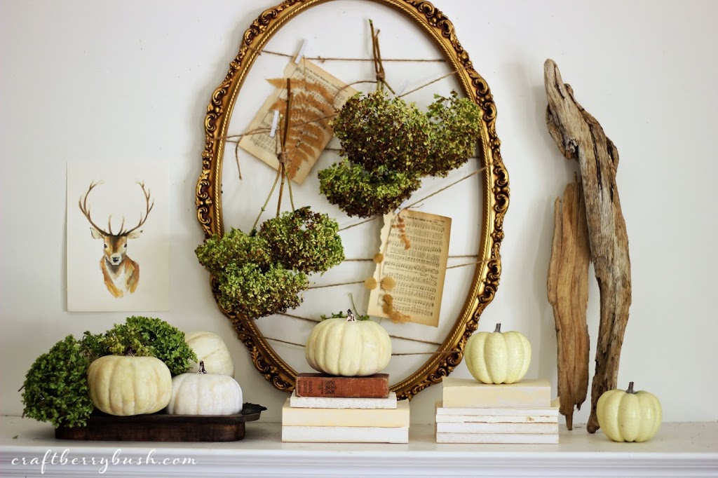
So I decided to hang them in bunches, incorporate music sheets
into the frame and place a piece of driftwood on the right to fill in the
space and balance both sides (without being symmetrical).
The rearranging of the mantel happened over the span of a week
and at this point I was getting really frustrated, so I left it for a couple of days.
This particular one, grew on me but I wanted to try one more…
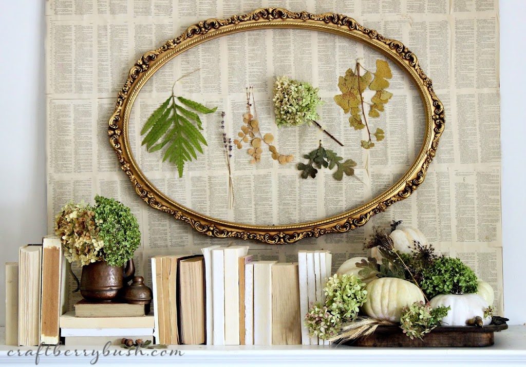
…and decided to go with this one for two reasons:
1. I was honestly tired of changing it
2. I really like the idea of displaying summer’s fallen beauty in the frame.
2. I really like the idea of displaying summer’s fallen beauty in the frame.
I think it makes it unique and I like unique.
So there you have it – the evolution of the fall mantel.
What do you think? Do you have a favourite?
I hope this inspires you to try different things and allow your creativity to guide you.
I hope this inspires you to try different things and allow your creativity to guide you.
Thank you once again for taking the time to visit.
I hope to see you again tonight at
I hope to see you again tonight at
The Inspiration Gallery.
much love,
Don’t miss a thing ! Follow Craftberry Bush via




They are all beautiful to me, Lucy! I don’t know how you wound up deciding on one! : )
Beautiful, I like it!
Greetings, RW & SK
If only I had a mantel…
Great job, love all of the above!!
gorgeous! I just love quiet it all seems, and hopefully that makes sense.
Mine usually goes through iterations, too, but I never think to take photos along the way. It’s absolutely beautiful!
That’s a tough one! I love the actual mantle layout on you final choice the best but I think my favorite wall decor would be a mix between the third one, (love the frame and deer painting) and then the book pages on the second one rather than the driftwood. (Although you might not Have four book pages. . .;) ) Thanks for sharing your process.
I love each and every one! but I can see why you went with the last one. It’s so artistic and beautiful.
Lucy I really like these mantels, the first is my favorite but they are all so beautiful. You can’t go wrong with any of them!!
Cynthia
I’m so crazy in love with all the mantel concepts. I see the reasons you decided to not go with each of them, but the simplicity of the natural materials made me die each time. Thank you for sharing these stunning pictures and ideas.
Amy @ http://www.delineateyourdwelling.com
I am in love with all of them! I especially am interested where you found the elk picture!
Thank you for sharing! I never tire of your inspiration!!
Evelyn from AZ
I like them all but I LOVE the last one the most! And I really want to know how much a pillow with your deer head is?
I love how you showed the evolution of your mantle, which looks amazing by the way! I featured this on my Friday Favorites, and by the way those pumpkins are adorable and I had no idea they were fake 🙂
~Katie @ Upcycled Treasures
I wish I had a mantle! Yours is absolutely beautiful! I love how natural it is!
Kristy @ Cup Of Jo
Ah they are all so stunning! Your talent and creativity never cease to amaze me!
-Molly
Ah they are all so stunning! Your talent and creativity never cease to amaze me!
-Molly
So pretty! You have such creativity! I’m jeaouls! Ha! Thanks for sharing. New follower.
I absolutely love this! So inspiring, thank you for sharing!