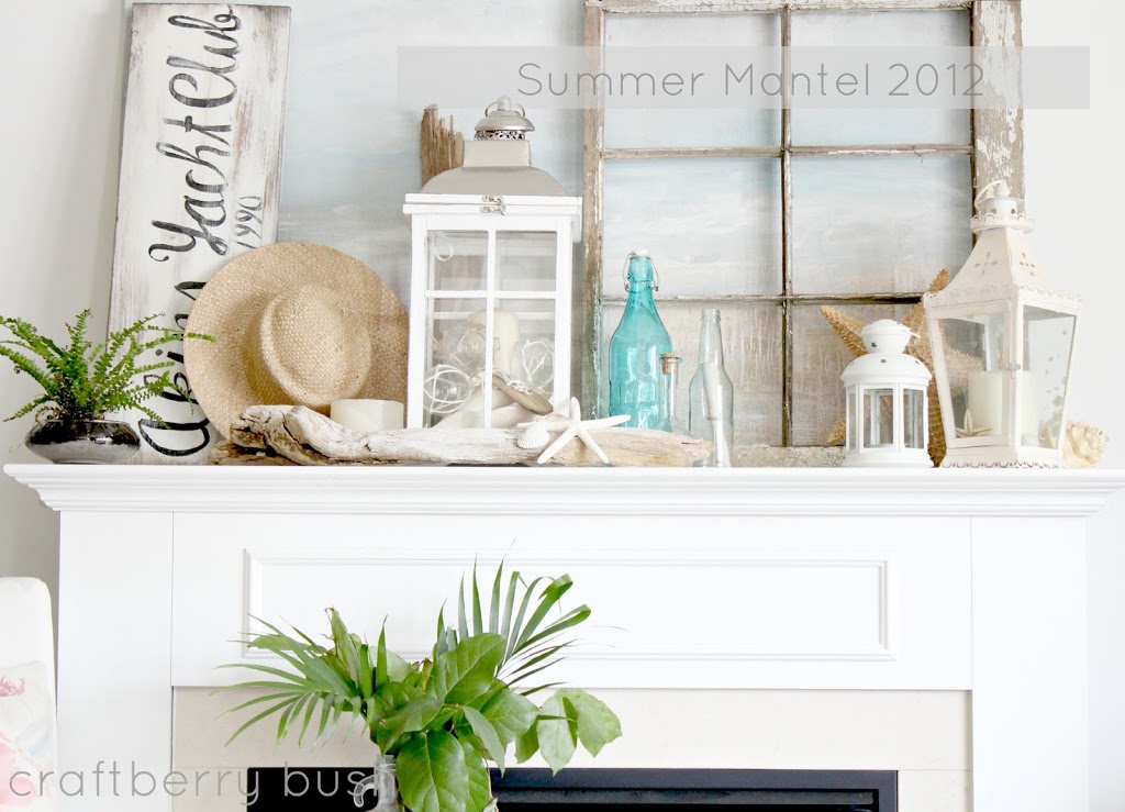
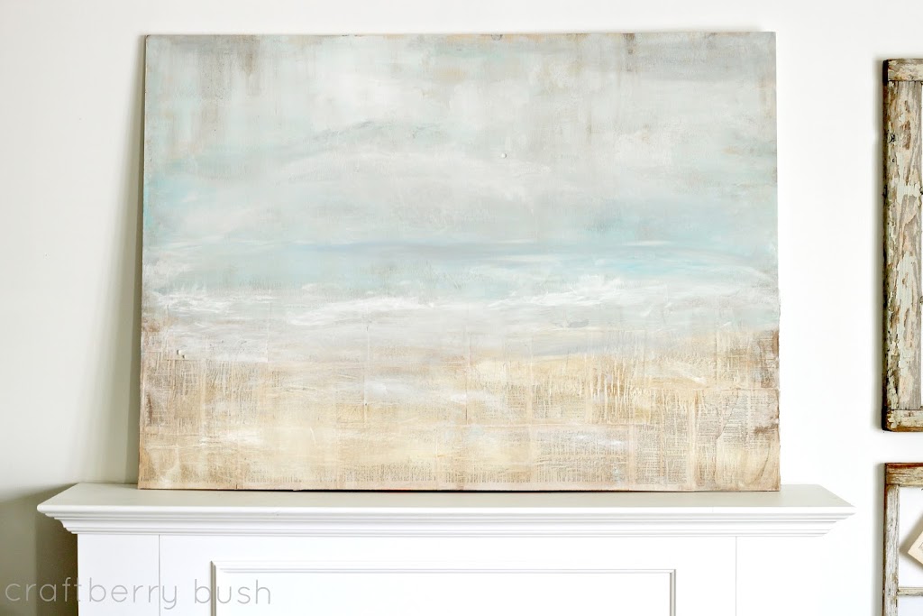
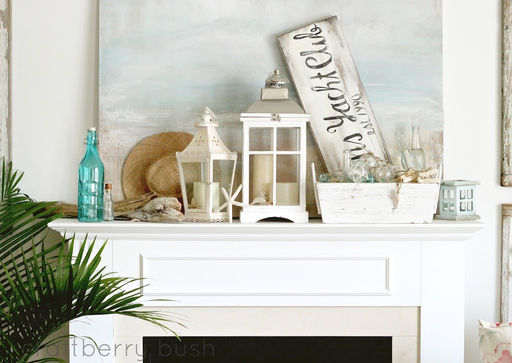
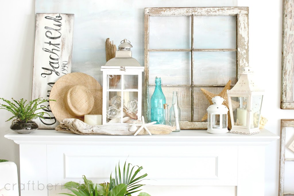
Unfortunately, I have changed this mantel several times and I’m still not completely satisfied with it. I’m not sure if it’s the anchoring art that I painted in the background that’s throwing it off for me (?). I wanted a beach scene, but the blues were too bright so I added glaze and now I think the colours might be too dull. I’m sure I will show you a new rendition soon.
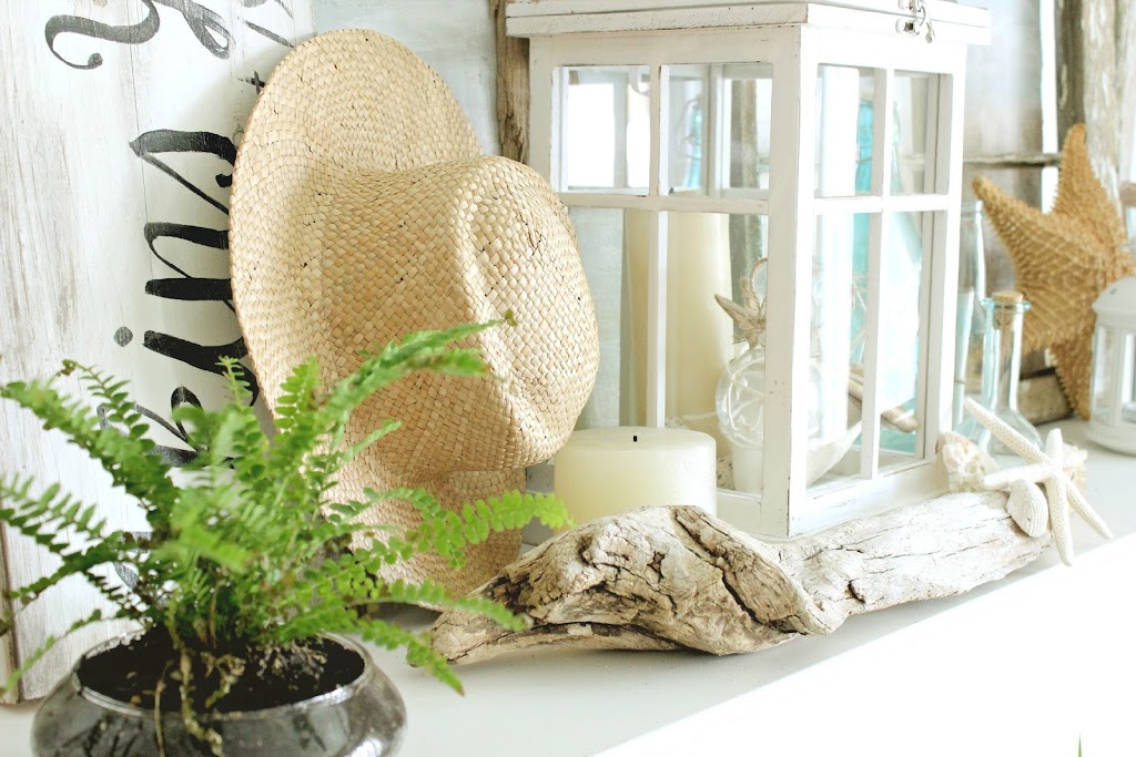
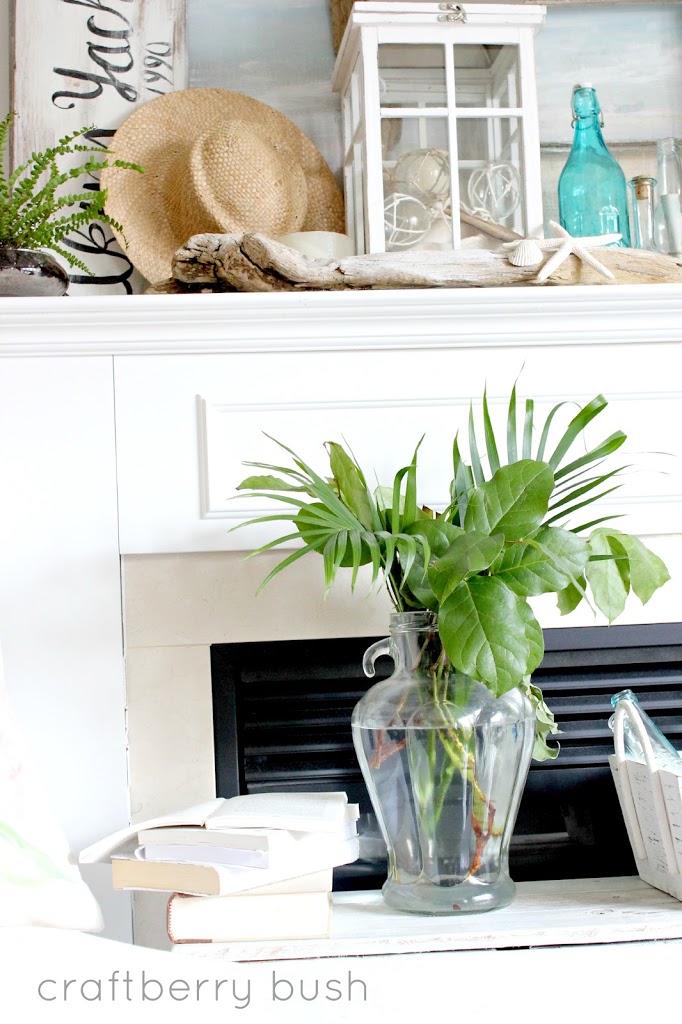
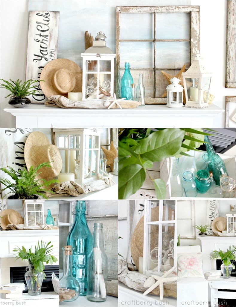
But in the meantime, I have used several items both, home made and bought. The large piece of driftwood did not always look like this. It is actually a piece of wood I found in the forest that I scrubbed and bleached. Have you ever heard of wood bleaching? It works wonderfully to give wood a white wash effect.
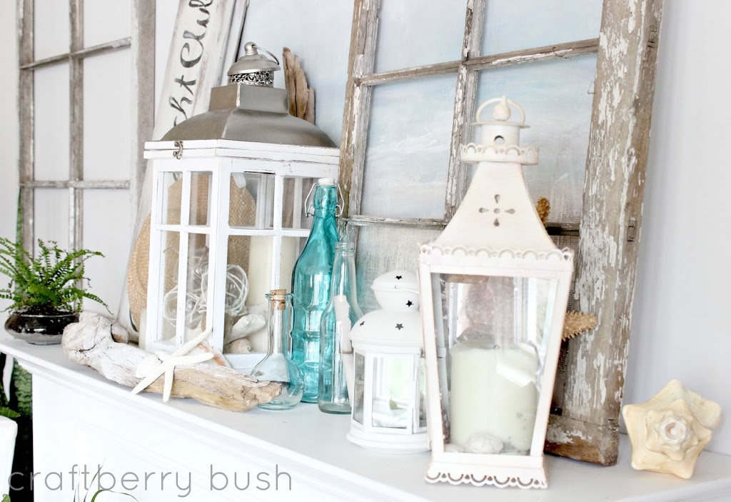
I found the big Pottery Barn look-alike lantern for $22.00 at HomeSense and decided to incorporate some of the other lanterns we had laying around the house…
During the hot months of the year when the fireplace is not in use, why not use the space in front to add interest to the mantel? Perhaps place a bench or a collection of greens in front of it so that you’re looking at something nice instead of a black hole.
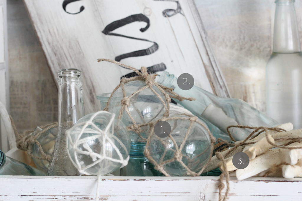
As mentioned, I have used homemade items and here is a list of where you can find each tutorial:
1. Glass buoy
2. Sea glass bottle or here
3. Clay Seastar
I also have a brief tutorial of the painting if you are interested.
So there you go – another summer, another mantel. Go here if you wish to see last year’s mantel. The same theme, but very different.
It sounds like we are gearing up for a hot summer and I hope you are enjoying it so far!
See you all soon.
much love,
Lucy
ps
Don’t forget to head over and link up…they’ll appreciate your presence…xo


Your mantle is beatiful. Love the pop of blue also and natural elements. Have a wonderful day!
Hi Lucy, you are very creative. I like both summer mantels, but the second version is my favorite. I can smell the sea and what a nice view to the beach through the window. Have a great time. Renata
I absolutely adore the painting and would love to see a tutorial. I was thinking before I read that you painted it that it was a great piece and I love how it looks through the window. Beautiful, mantel. Thank you so much for joining out little party!!
Love your mantel! I still have my spring mantel up…sigh…too many things happening at once here! Love the coastal look and the colors!
Blessings, Lorraine
I’ll take all versions. I just LOVE your mantel. This needs to be shared…I’m on it!
Shasta @InTheOldRoad
it looks so beautiful i love your style xxx
Beautiful ! You mentioned a tutorial for the painting technique, but I couldn’t find a link or post. You have inspired me to paint a beachy canvas to put over the mirror on my mantel for the summer. Thanks
http://homedeco50.wordpress.com/
They both look great, but the 2nd version is my favorite! Love your style! Very pretty!
Wow.wow.WOW! Gorgeous. I like the one with the window (2nd, I think?). It’s spectacular.
So pretty! My first thought was to move the sign with to face the other way, then I scrolled down and saw you did that in the 2nd pic. I like it much better! The sign sticking out of the basket was really taking away from everything else, because I wanted to tilt my head and read it. LOL!
Beautiful Lucy, just Beautiful!!
Huggs, Nancy
Beautiful mantel, I love your style! Both versions are great, my favorite is the 2nd. I would love to see the tutorial of the painting
Beautiful I like both versions. I love everything you do! Thanks for visiting and leaving such a nice comment, made my day!
Your mantel looks great, love the colors.
Love the mantel. I especially like the large painting you did, it makes a great background
I love the 2nd version Lucy… I think the sign placement and bottle accent look best in the way you have them arranged in #2 option. You are one very talented lady and I so love your decorating style. Just truly beautiful and I agree that painting is so calming and cool. I’d love to know how you toned it down, as I have a scene my mil painted for me that would be so much better with the colors toned down a bit. Thanks!
Gretchen
I love your painting and think I’d make a little space in the “off” center to show it off more!
Hello Lucy! Your mantel is beautiful. I prefer the firs version.